Analysis of Predicted Fire Service Travel Time Boundaries in Republic of Ireland.

Map showing isochrones of 1 to 10 minutes, generated with Open Route Service, from Fire Stations in the Republic of Ireland.

Background
Ireland, like most developed nations, has developed infrastructure which provides for response to life- and property-threatening emergencies. One of the strands that underpins this is the network of fire stations throughout the country. The Fire Service in Ireland is delivered via local government, each local authority having a responsibility to;
(a) make provision for the prompt and efficient extinguishing of fires in buildings and other places of all kinds in its functional area and for the protection and rescue of persons and property from injury by fire, and
(b) establish and maintain a fire brigade, provide premises and make such other provision as it considers necessary or desirable for such purpose, and
(c) make adequate provision for the reception of and response to calls for the assistance of the fire brigade.
per the Fire Services Act, 1981.
The majority of Fire Stations in Ireland (196 out of 216) are on a retained system, with crews being alerted to a call via a pager. The main urban areas operate full-time crews, with firefighters based at stations and alerted from there.
While administration of Fire Services is devolved to local authorities, there is a national body called the National Directorate for Fire and Emergency Management which coordinates these efforts on behalf of the Department of Housing, Local Government and Heritage. A document setting out standards for the Fire Service was published in 2013, called Keeping Communities Safe. The standards set out in this document will be referenced repeatedly in this analysis.
Methodology
demographic data
The demographic data is based on the Pobal dataset, available at https://maps.pobal.ie, which creates a geography of deprivation / affluence and a "Deprivation Index". In my opinion, this is one of the most useful interpretations of the Census Data, as it gives longitudinal and derived information about key demographic information. To access it, go to the aforementioned url, and create a geoprofile of your area of interest. For this analysis, I selected every county in Ireland and build a geoprofile at Small Area level, the smallest granularity available.
Haase, T. and Pratschke, J. (2017) The 2016 Pobal HP Deprivation Index, accessed at www.trutzhaase.eu
ISochrone generation
Using the location data for Irish Fire Stations (available here), and a locally hosted OpenRouteService server (see setup process here), the time travel boundaries (from here on in the TTBs) were generated. This process was orchestrated via QGIS and the very handy ORS Processing tool. Three batches of 1 to 10, 11 to 20 and 21 to 30 minute isochrones were built, and then merged into one dataset.

Parameters for isochrone generation.
census data extraction
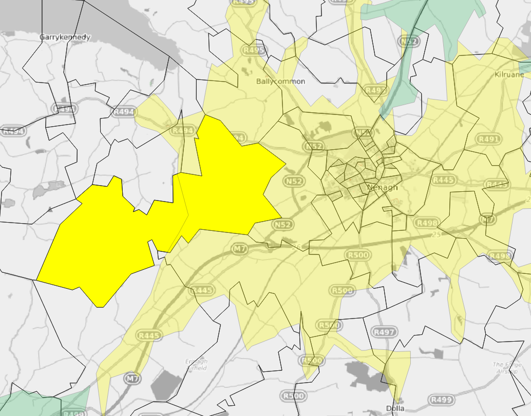
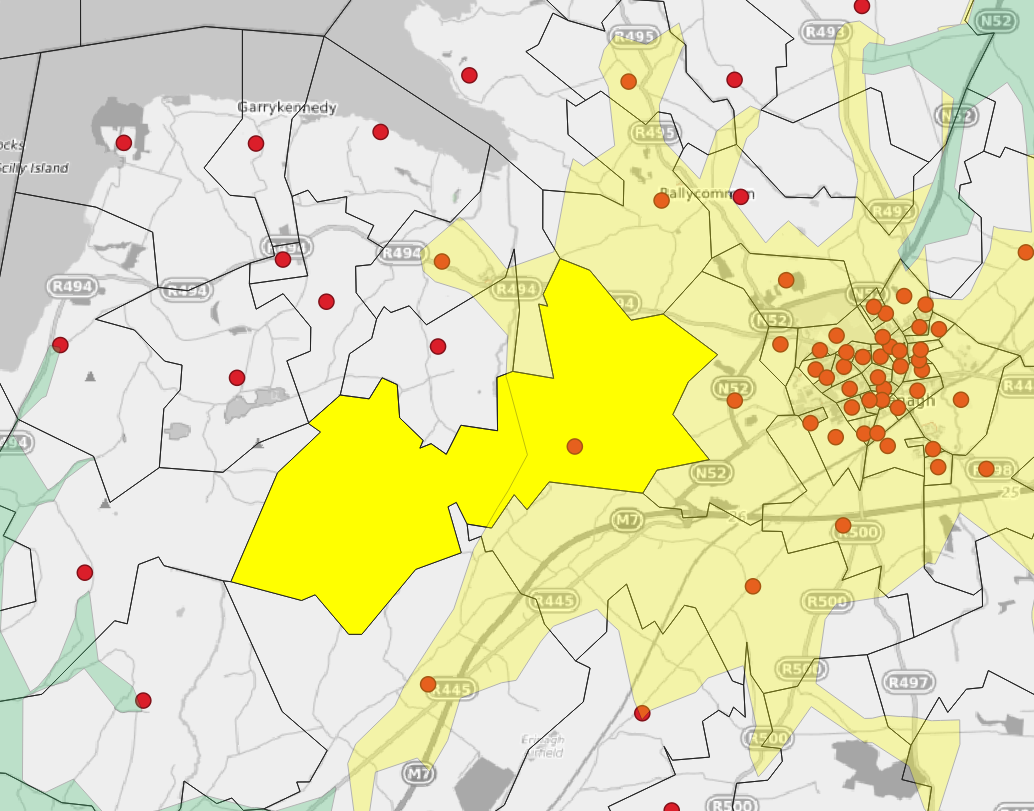
In order to perform some demographic analysis, it is necessary to transform the Census data into a format that allows some comparison of the TTBs with the area that it interescts. Comparing the Census Small Area polygons with the TTB polygons would result in very difficult to interpret results, which would also have no real semantic value. In the first image below, 50% of the Small Area polygon lies in the 10 minute TTB, and 50% sits outside. But the population actually is dispersed throughout the polygon, possibly clusted to one side or another. So some method of abstraction has to be used. In this case, it is best to create a point on the polygon and use its intersection with the TTB as the analysis target, as in the second image.
Then, we can calculate the minimum travel time boundary interesected by each Small Area point. This has some drawbacks when dealing with areas of sparse population (bigger polygons) or remote areas (point has a higher chance of not being adjacent to road network) but is relatively useful for the majority of the country. There were 40 or so Small Areas that didn’t have a Small Area / TTB point / polygon intersection, so for this subset, a polygon / polygon intersection was used.
The Small Area points were generated using the QGIS “Point on Surface” tool. This was used as opposed to centroids as the latter can sometimes generate points outside the reference polygon.
analysis
The geometries and their respective attribute data were then read into an R Notebook and analysed - this can be found at https://github.com/mick-odonnell/irish_fire_stations. The sf and dplyr packages were used and the main steps in the analysis were;
Load data and transform to EPSG:2157 (some data quality issues were encountered when using the EPSG:4326 data).
Create the intersection of the TTBs and the Small Areas with
pobal_pts_with_containing_ttbs <- pobal_2016_pt %>%
  select(GUID) %>%
  st_join(firestation_ttbs,
          join = st_intersects) %>%
  st_set_geometry(NULL) %>%
  select(-c(AA_MODE, TOTAL_POP))
The minimum intersected TTB, along with the station(s) is then calculated via;
pobal_pts_with_containing_ttbs %>%group_by(GUID) %>%mutate(min_ttb = min(AA_MINS)) %>%filter(min_ttb == AA_MINS) %>%select(GUID, ID, min_ttb, AA_MINS) %>%group_by(GUID, AA_MINS) %>%summarise(ct = n(),first_stations = paste(ID, collapse = ' | ')) -> sa_first_responsesThis process is repeated for the remote SAs, and then the small subset that do not have any 30 minute intersection is retrieved, and the three subsets are merged;
non-remote Small Areas
remote Small Areas
>30 min Small Areas
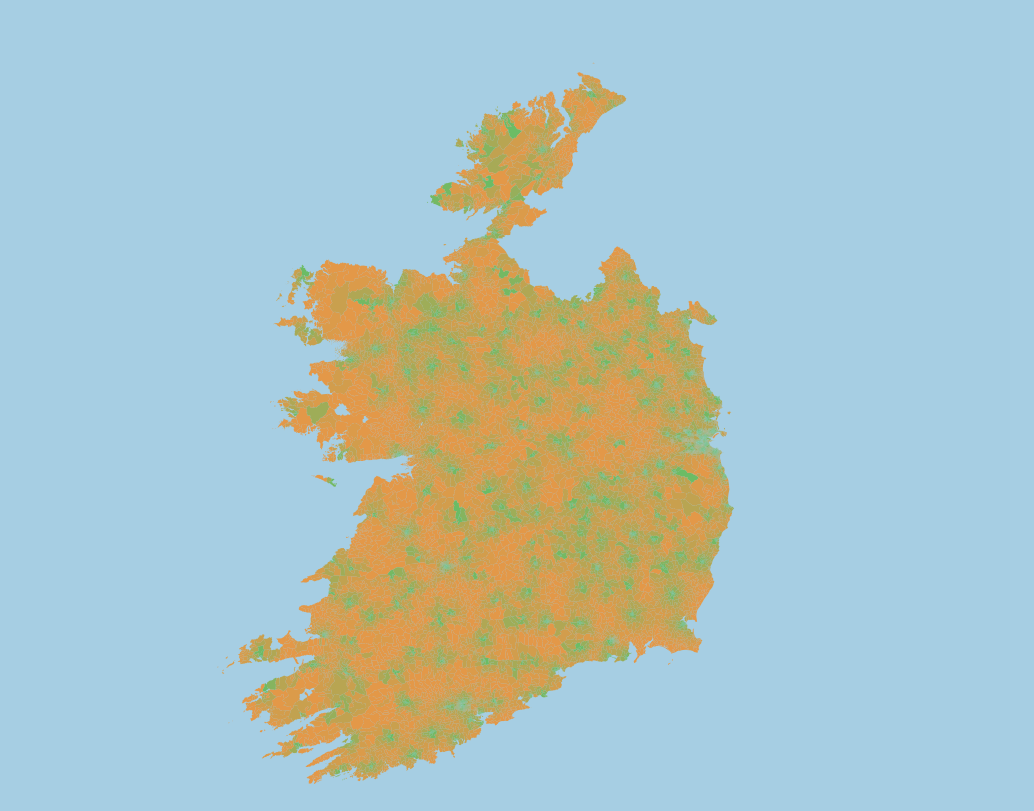
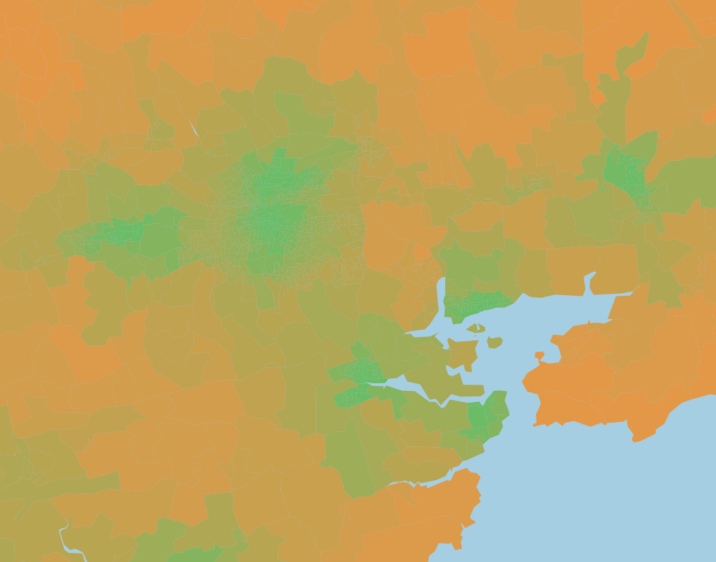
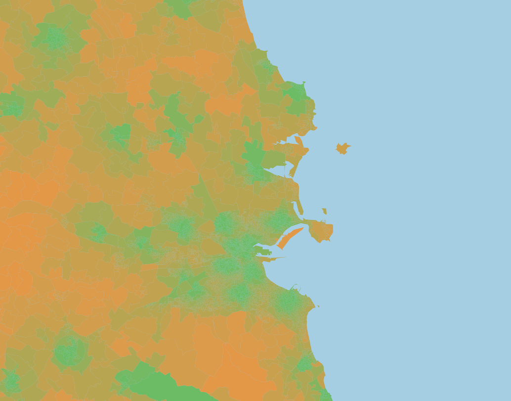
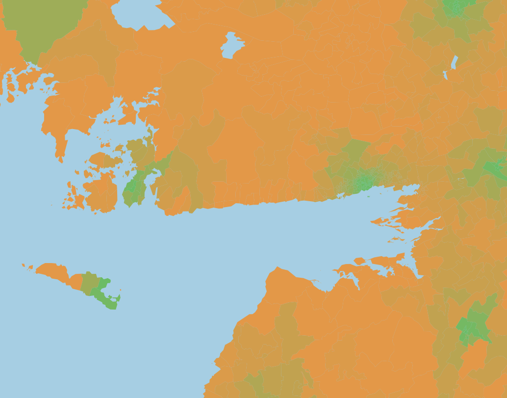
The images below illustrate how the pattern of lower travel time is aligned with both population centres and major arterial roads.
Visualisation
I then produced a Tableau visualisation of the data, to enable exploration of the dataset, which can be found on my Tableau Public site - here.
Some comments;
For raw travel time, just over 70% of the 2016 population, or 3,323,771 people live within 10 minutes travel from a fire station.
When time is added for crews to mobilise, (2 mins* for full-time, 5 mins for retained) the coverage of the population is 54% or 2,535,799.
The coverage is coincident with population density for the most part, but there seem to be some areas where coverage has not kept pace with population. Some more detailed analysis of this trend would be worthwhile.
It would be interesting to see if there are any patterns with respect to coverage and deprivation index.
Small area closest ttb

Tableau Visualisation of Small Areas and Minimum TTB
fire station ttb

Tableau Visualisation of Fire Station Travel Time Boundaries

