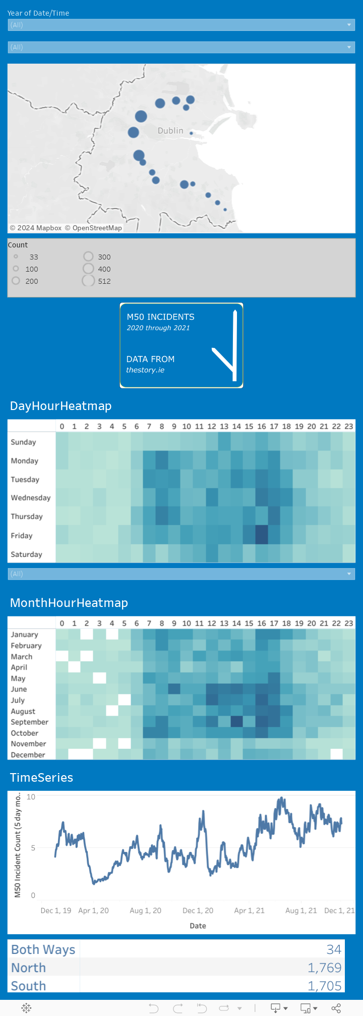
M50 Incidents Visualisation

I’m a big fan of https://www.thestory.ie/ and their dogged pursuit of information and accountability. Their archives are well worth a dig through, and through a lot of light on the poor state of open data, freedom of information and the general lacklustre approach to transparency and accountability by officialdom in Ireland.
There are plenty of examples of how the establishment thwarts accountability by simply ignoring FOI requests, stating that a search would be too onerous to complete (though if the information is on a database, anyone with a modicum of SQL knowledge would be able to extract the data), or even when an FOI request is honored, the data is released in a non-machine readable format such as pdf tables.
Most recently, thestory.ie published a dataset of incidents that occured on the M50, and since I have been on the lookout for some Irish data that has a spatio / temporal component, I am going to use it to produce some visualisations and interactive dashboards.
The link to this story is here and you can download the data from their repo here.
Preparation
The dataset is fairly simple and is a table of all incidents since the start of 2020 until a few months ago with some coded location information, an incident category and the time and duration of the incident. For this dataset, I am going to try and do most of the data preparation in QGIS.
Step 1 - Extracting the location from the Incident ID
The format of the IncidentID incorporates the location of the incident and the timestamp; M50-J14J15-200108-1346 . I imported the .xlxs sheet into a geopackage layer, then used the field calculator to create a new location field, overwriting the existing one which just has M50 for all rows. The formula used is as follows;
if( "Category" = 'None', NULL, substr( "Incident ID" , 5, length( "Incident ID") - 16))This uses the fact that some incidents with a “None” category designation are weather events that effect the whole M50. There is no location specified in these cases, so I’ve used a NULL value in the column to represent this. Otherwise, I’m just using the substring function with a start value of 5, and a “length - 16” value for the search length as the non-location part of the input is fixed (M50- plus DATE-TIME).
Step 2 - Quality Control
Looking at the locations, most of them can be mapped to a single juntion (where only one junction is listed) or to a combination of junctions, which I take to mean the stretch of the M50 between the two mentioned junctions. There is also a direction field which will indicate which ramp or carriageway the accident occured on. I’ve very much simplified the location element by simply using the first junction mentioned as the location, as the system for extracting the exact location isn’t defined anywhere, and seems pretty complex.
There are a lot of locations that only apear seldomly, generally with an “A##” or “B##” extension. I have ignored these locations and removed them from the dataset for convenience.
To extract the duration of the incidents, I had to use some regular expressions within the QGIS feature editor, to extract the day, hour and minute elements, then pul them back together to get a minutes column:
regexp_substr( "Duration" , '^(\\d) days.*')regexp_substr( "Duration" , '.*(\\d{1,2}):\\d\\d:\\d\\d')regexp_substr( "Duration" , '.*(\\d\\d):\\d\\d$')if("days" IS NULL, 0, "days") * 3600 + if("hours" IS NULL, 0, "hours") * 60 + if("minutes" IS NULL, 0, "minutes")
Step 3 - Visualisation

Tableau Dashboard - M50 Incidents Visualisation
The dataset was exported as a geojson file, with CRS WGS84. Then I created a visualisation with Tableau, and uploaded it to Tableau Public. The geojson file itself can be downloaded here.